Industrial Design, Academy of Fine Arts, Wrocław

Portfolio ©2026

Lena
Wojewódzka

Hi, I’m Lena, a fourth-year Industrial Design student at the Academy of Fine Arts in Wrocław.

While my formal specialisation is transport design, my imagination has never stayed in one lane. My true passions lie in interior architecture and unconventional concepts that often cross over into fantasy and game design. I work primarily in 3D, treating bold colours and strong narrative as the very foundation of my projects, rather than just finishing touches.

In my portfolio, you’ll discover a mix of environments, future mobility, and imaginative spaces that refuse to fit into a single genre. I continuously expand my skill set to keep pushing these creative boundaries, which is why I’ve also completed courses in AI and architecture to truly understand the tools I use.

01 / 05

10.2024–01.2025

DART(01)

01

brief

The starting point was simple: what does someone actually carry around a city on a normal day? Groceries, a backpack, a handful of parcels: things someone would otherwise carry on foot or cram into a car they didn’t even need for the trip. That’s the scale I designed around, and it holds whether the rider is running a personal errand or doing a last-mile courier run. Either way, the bike needed to slip through traffic and narrow streets while still carrying a real load.
02

silhouette

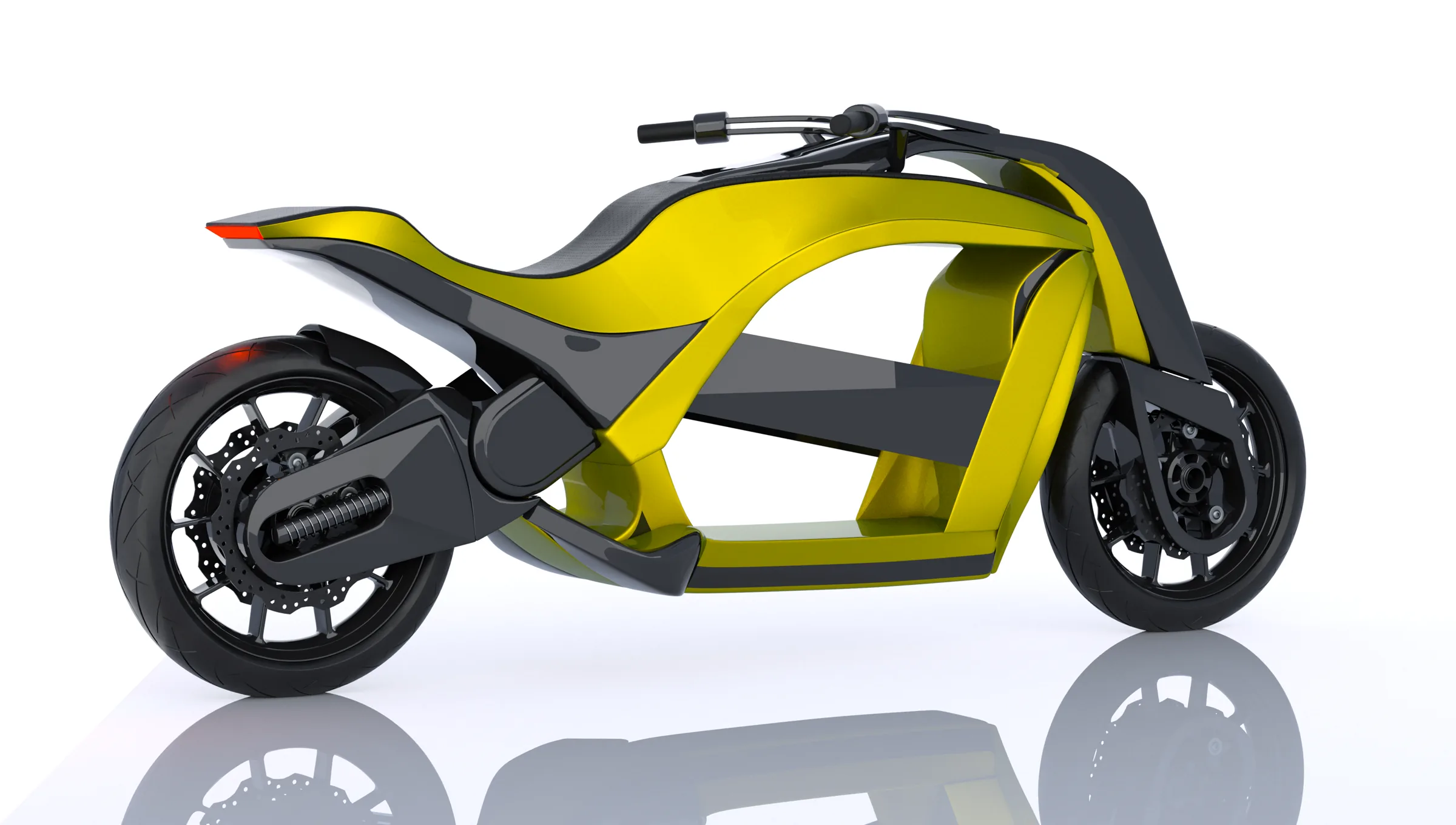
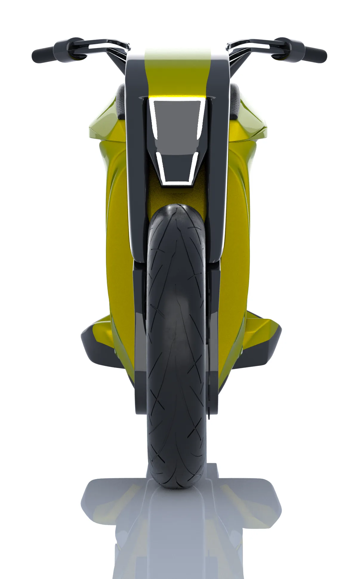
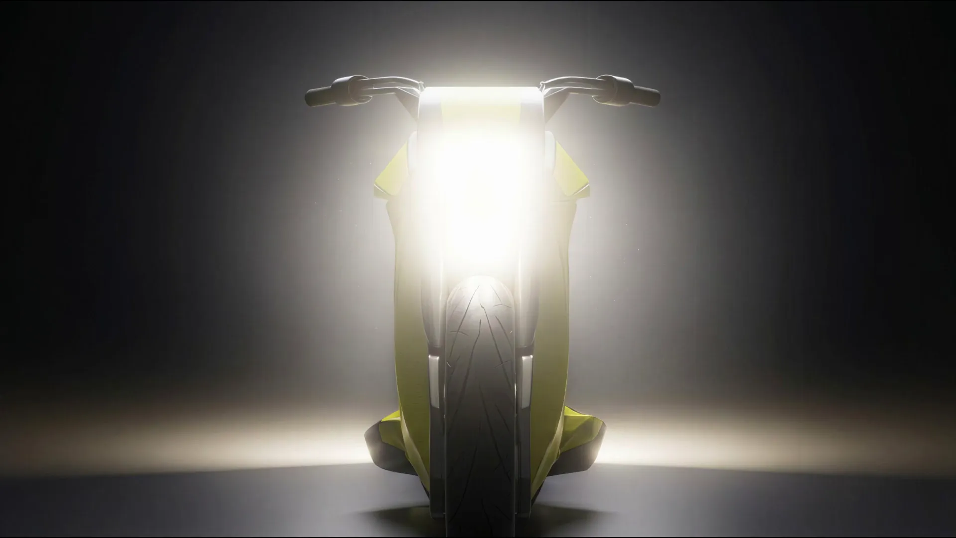
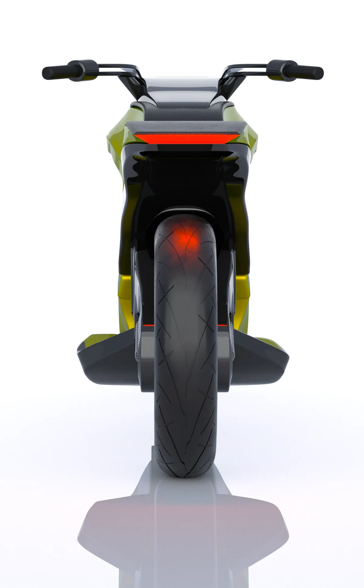
I didn’t want DART to read as a utility vehicle with a box strapped on. I wanted it to look like a motorcycle that has this built into its DNA. That’s where the dynamic, flowing shape comes from, despite the extra weight up front.

03

ergonomics and handling

The riding position was designed with longer delivery routes in mind, not just short city hops. The low center of gravity also helps with maneuvering in heavy traffic.

04

concept

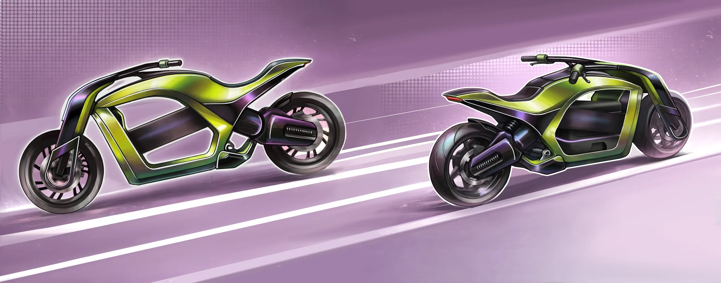
Instead of bolting a cargo box onto an existing motorcycle, I wanted the loading space to be part of the structure from the start, not an add-on. That’s how DART came about.

05

decision: central cargo

I placed the cargo low and centrally, between the wheels, rather than at the back like most courier bikes. That keeps the center of gravity low even under full load, which makes a real difference in handling.

06

frame

The open frame works as both the skeleton of the bike and the housing for the cargo compartment. That setup makes it easy to change the size and shape of the space depending on what the bike needs to carry.

DART 01
DART 02
DART 03

07

modularity

A private person and a delivery company courier don’t need the same thing, so the cargo system is modular. The same platform handles small parcels just as well as heavier, everyday loads.

DART 04
DART 05

08

process: sketches

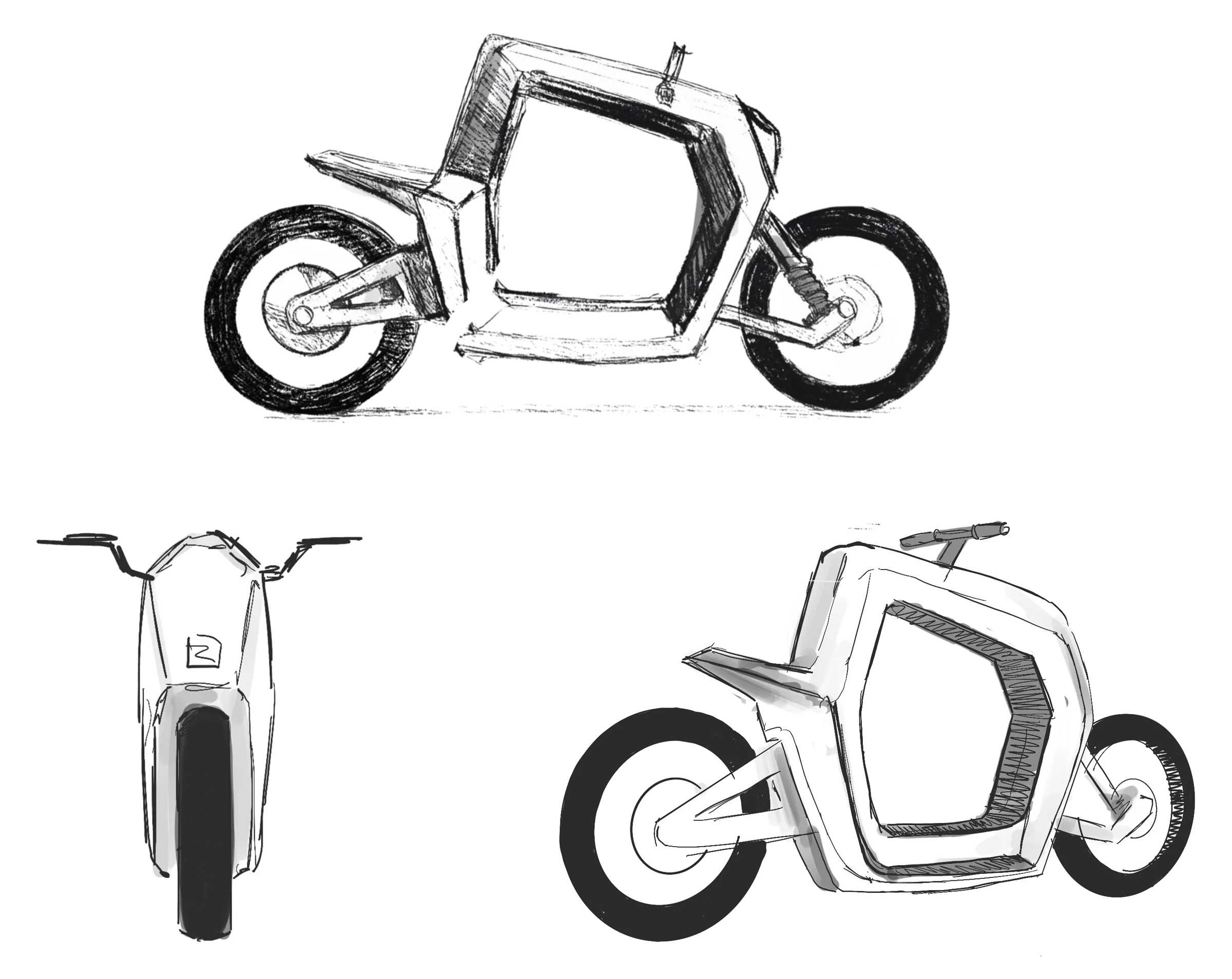
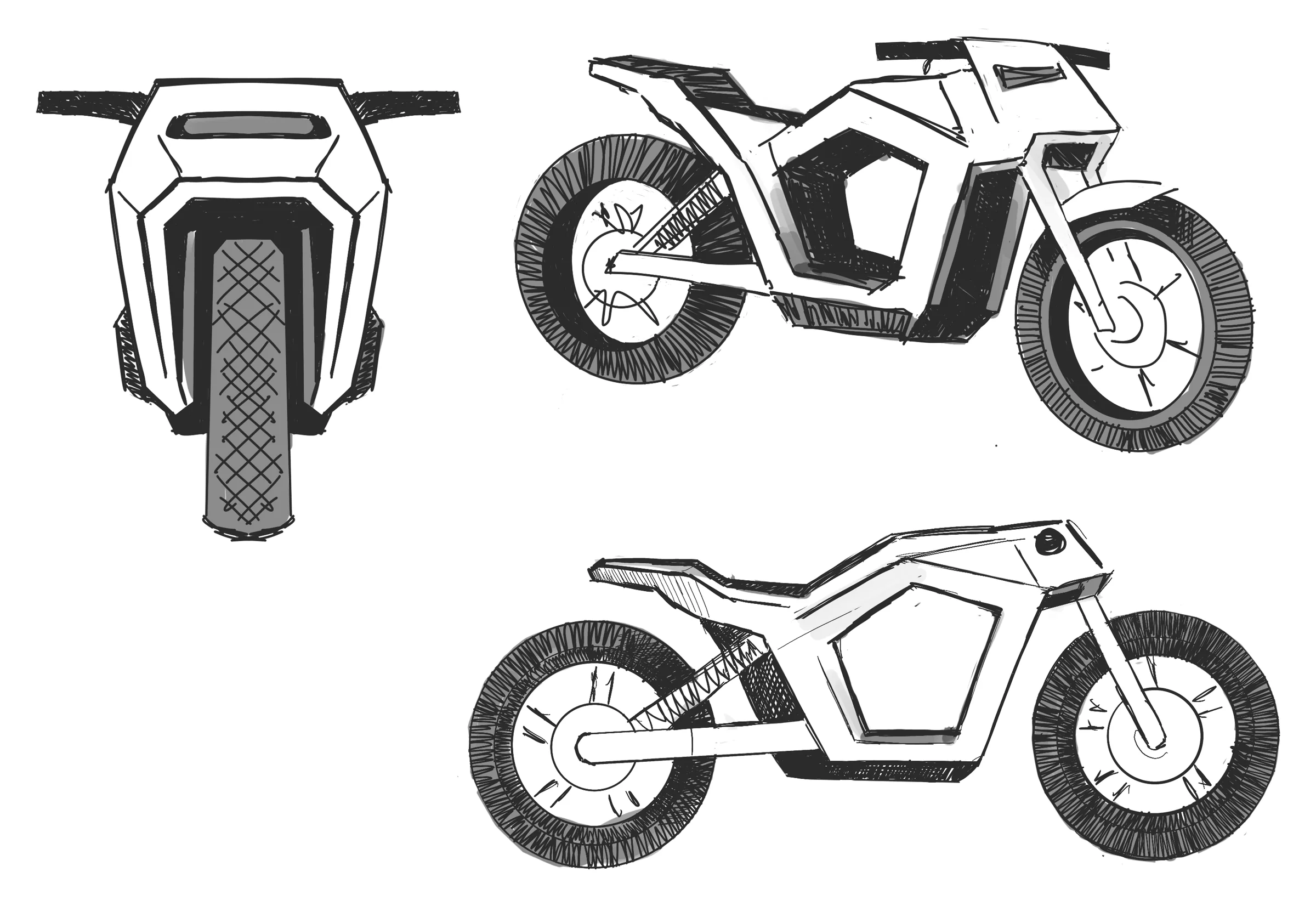
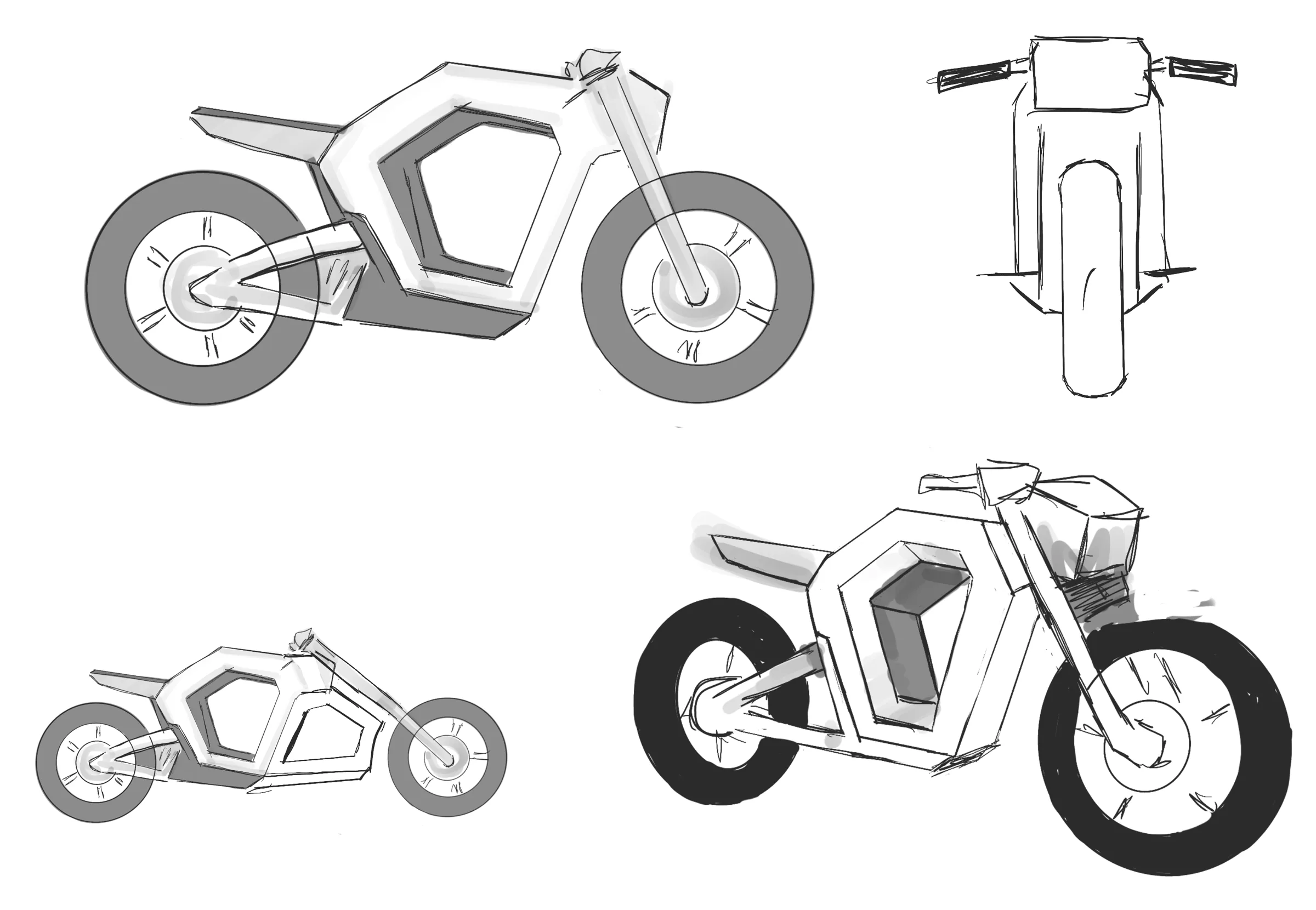
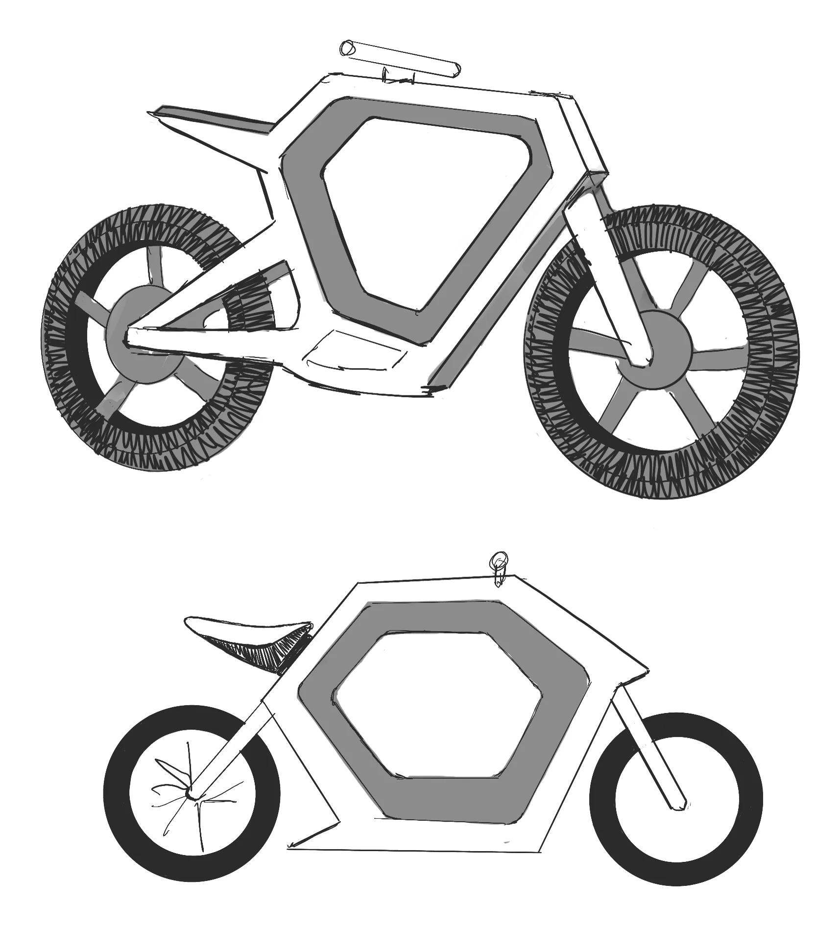
The project started with digital hand sketches: a dozen or so variations on proportions and frame layout before one of them felt coherent enough to move forward with.

DART 06
DART 07
DART 08
DART 09

09

3D modeling and color

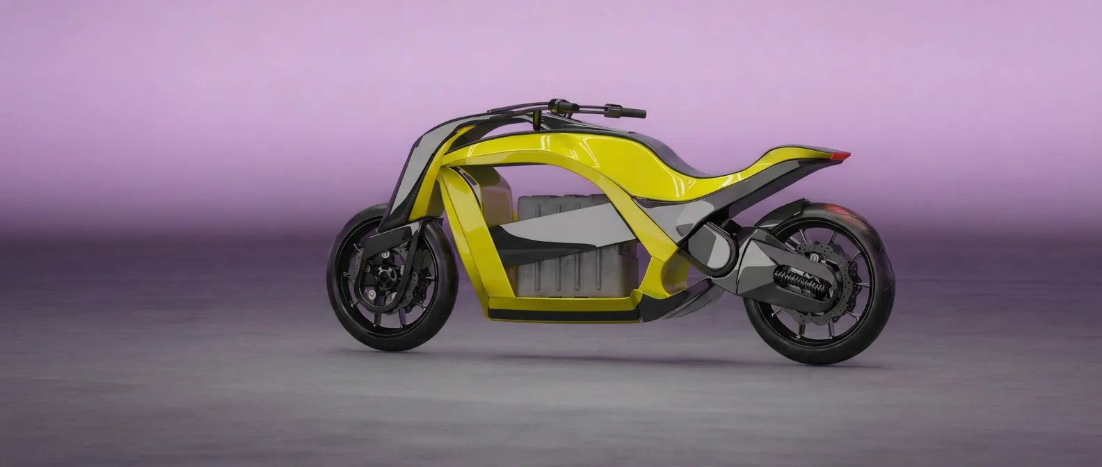
The final form came together in full 3D modeling, where I tested different color options, from a muted yellow to more aggressive tones.

DART 10

10

closing

DART is a concept project, but built with a real use case in mind: electric last-mile delivery in the city. For me it’s also a chance to show that a utility vehicle doesn’t have to give up character to do its job.

02 / 05

01–06.2026

HOBBIT HOUSE(02)

01

brief

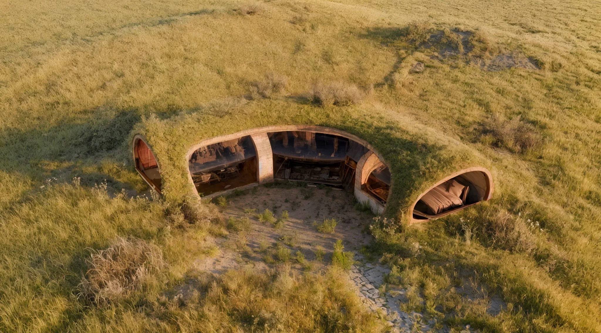
“My inspiration for designing this holiday villa was the aesthetic of the Hobbit houses. However, I was keen to avoid overdoing it, and my overriding aim was to create a building which, despite its organic, fairy-tale atmosphere, could realistically be built in our world, whilst adhering to contemporary building standards and realities.”

HOBBIT HOUSE 01

02

concept

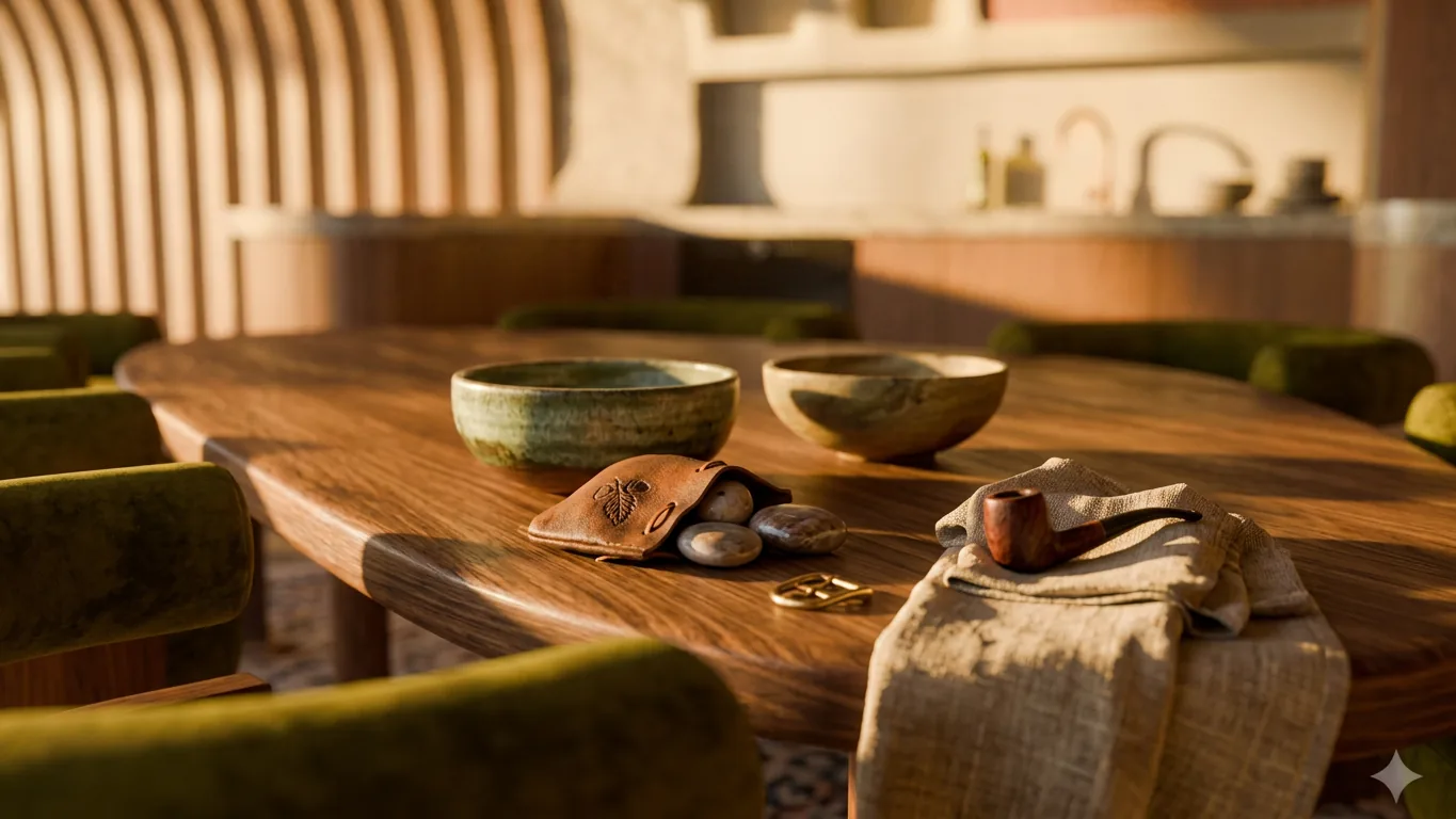
The idea was to prove a magical, storybook feel and modern comfort aren’t opposites. Fairytale architecture on the outside, a fully functioning luxury recreational house on the inside. The two had to sit together without either one apologizing for the other.

03

form and setting

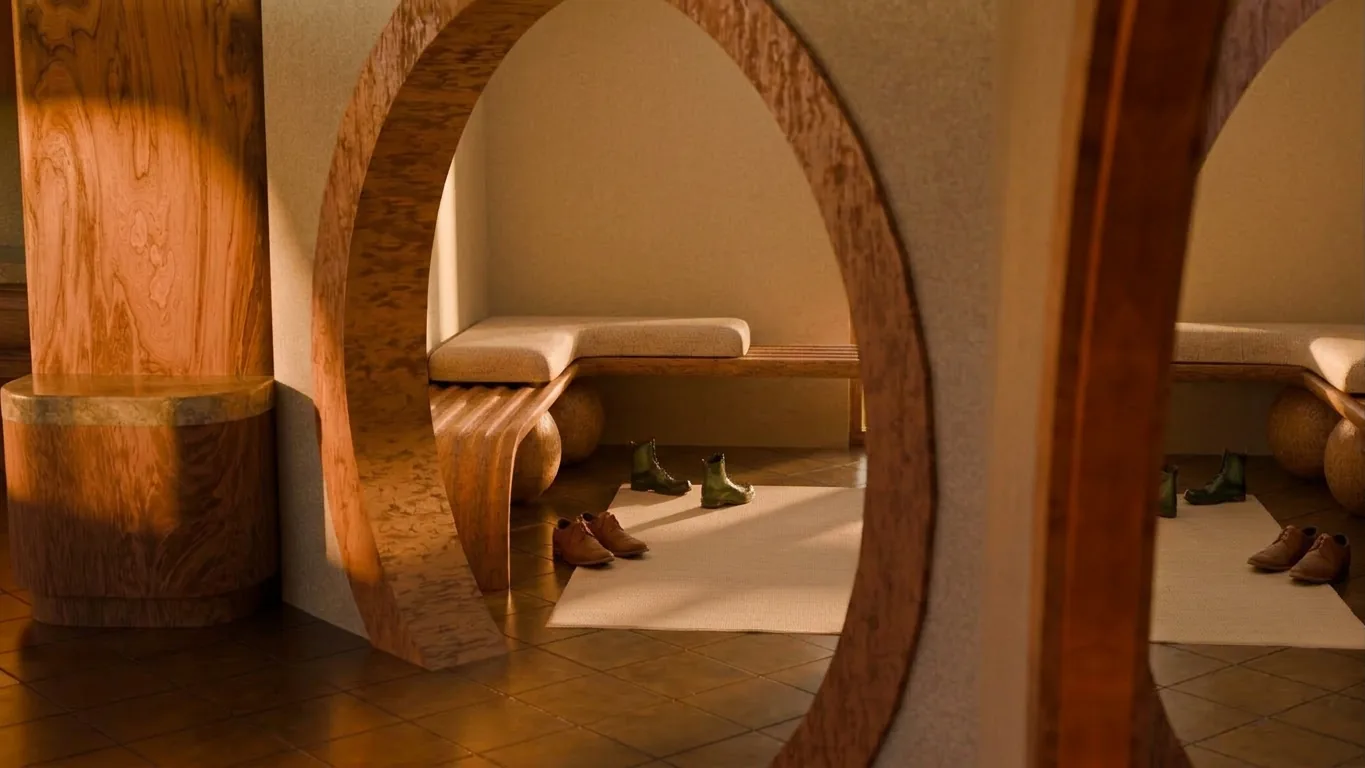
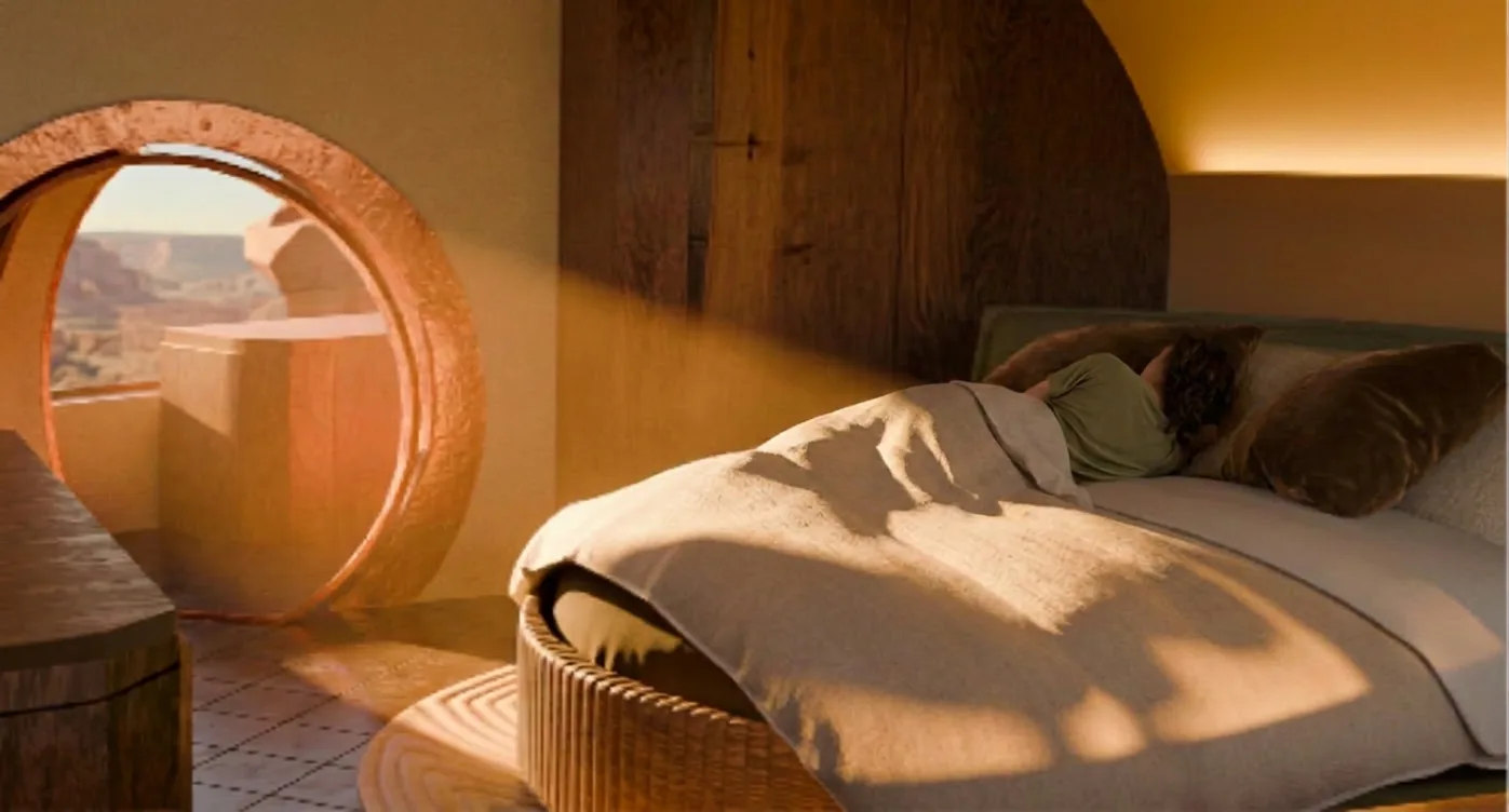
The building’s organic shape and earth insulation let it sink into the landscape rather than sit on top of it. Combined with the rounded elevation, that gives guests something close to an intimate hideaway: a place that feels shut off from noise without feeling shut in.

HOBBIT HOUSE 02
HOBBIT HOUSE 03
HOBBIT HOUSE 04

04

interior logic

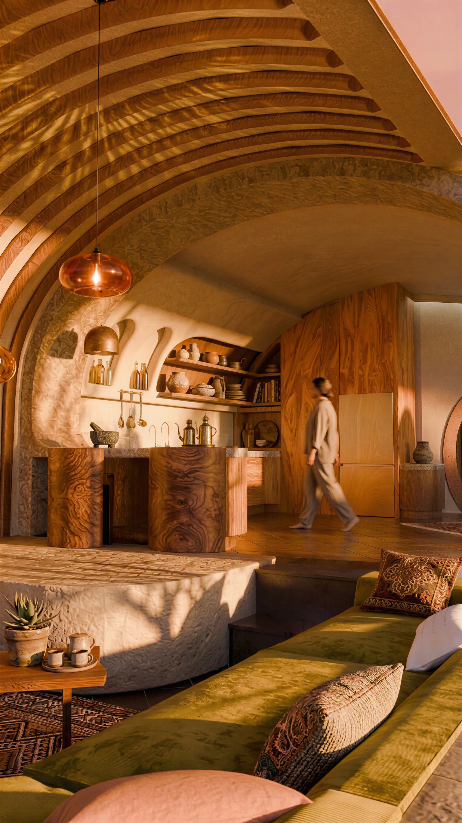
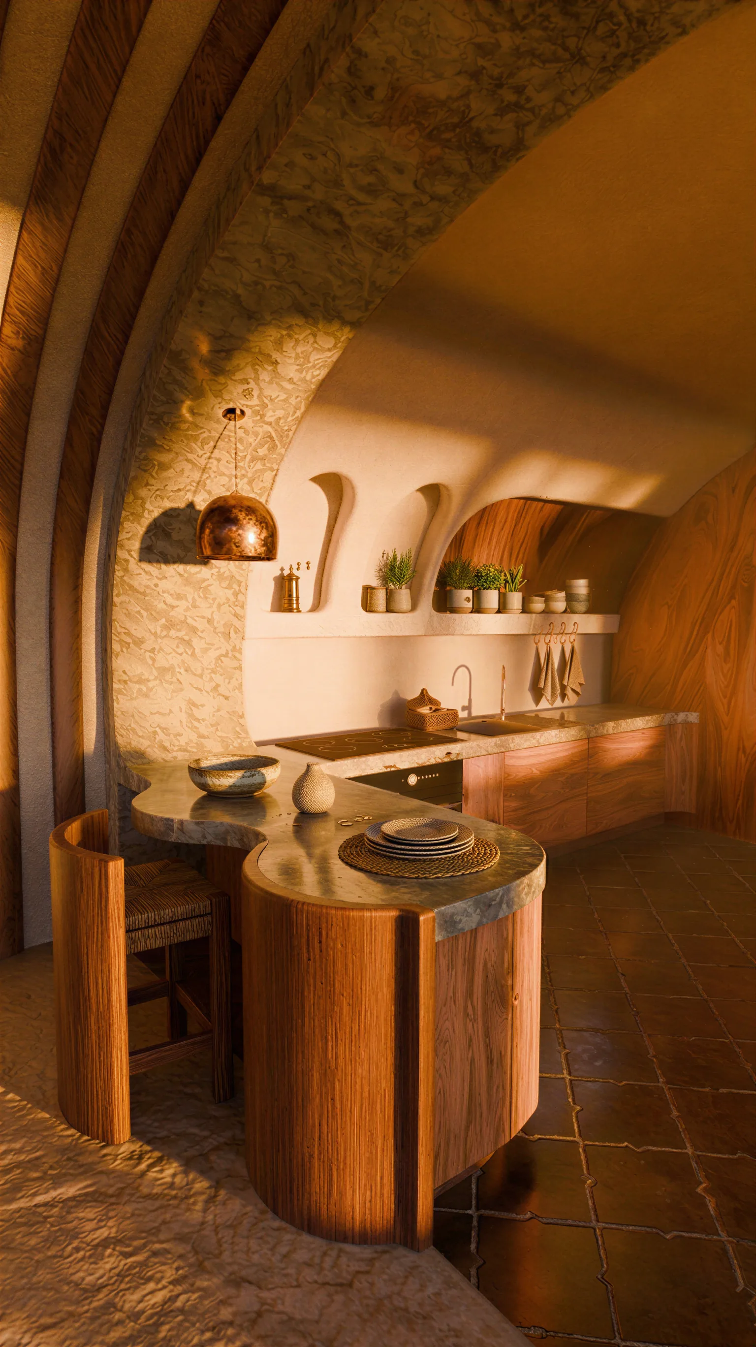
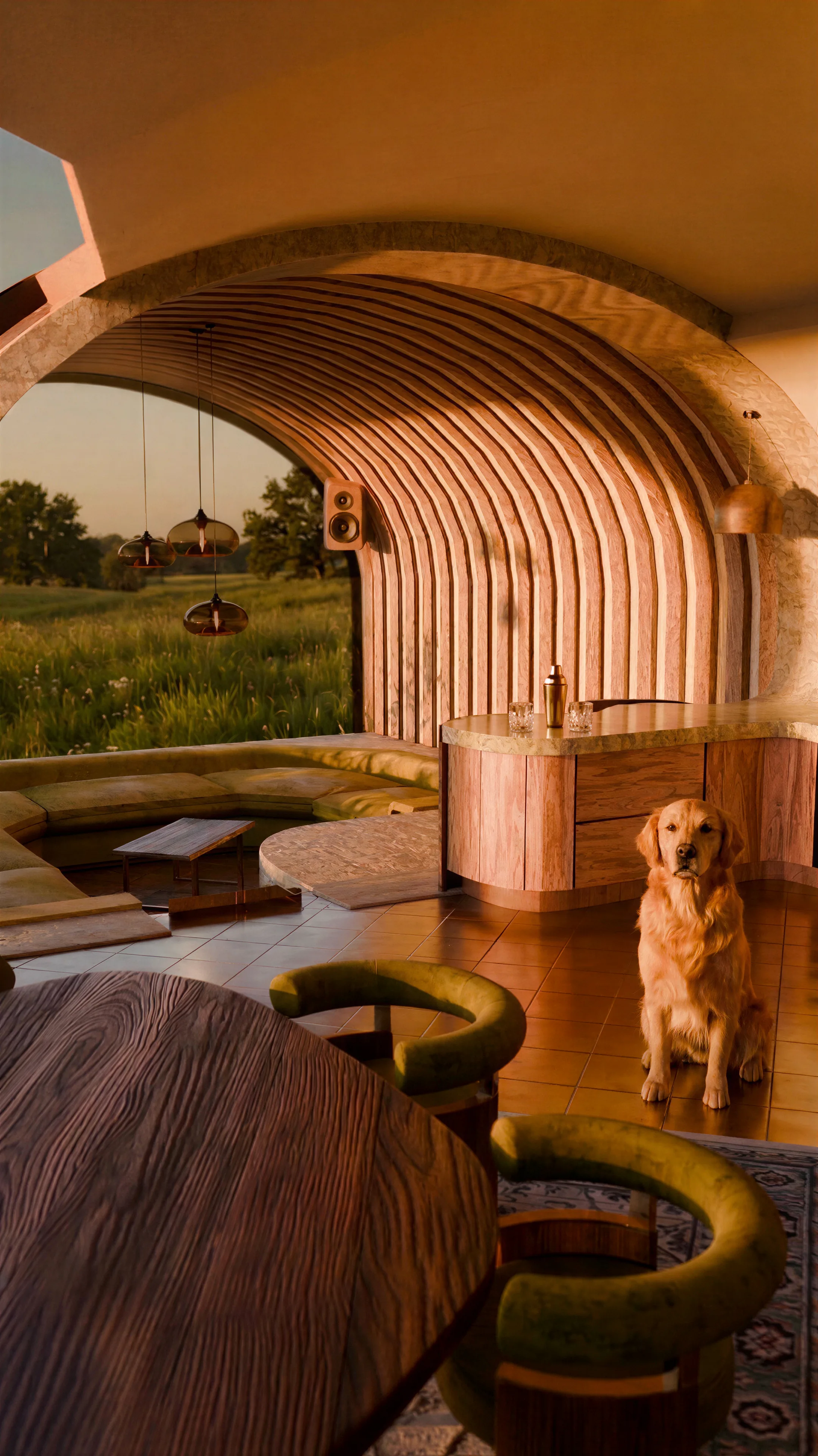
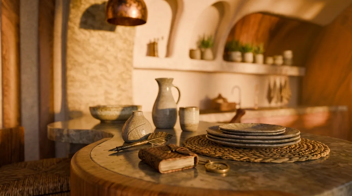
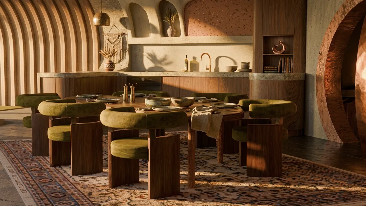
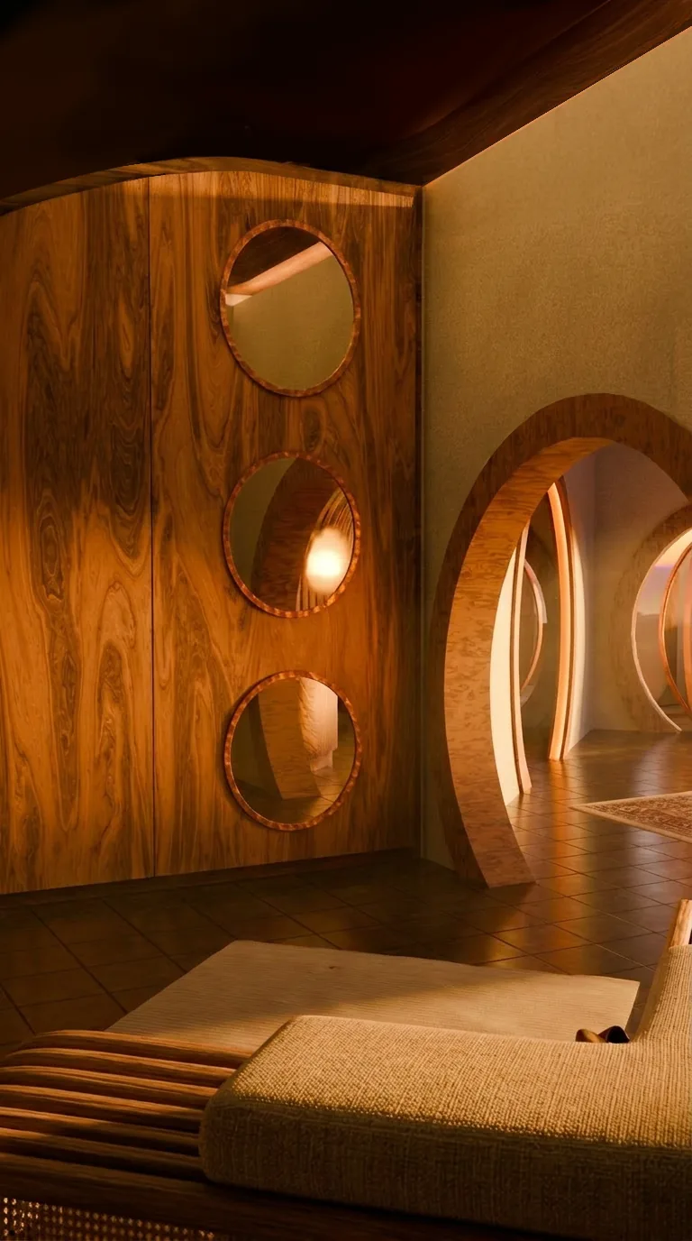
Inside, the same logic continues: no sharp corners anywhere. Soft lines, arched doorways, round glazing: the interior follows the same rules the exterior does instead of switching to something more conventional once you step through the door.

HOBBIT HOUSE 05
HOBBIT HOUSE 06

05

materials

Natural wood, stone, earthy tones throughout. It’s what ties the house to the ground it’s built into, while the actual detailing (fittings, layout, finish) stays fully modern and ergonomic underneath.

HOBBIT HOUSE 07
HOBBIT HOUSE 08

06

floor plan

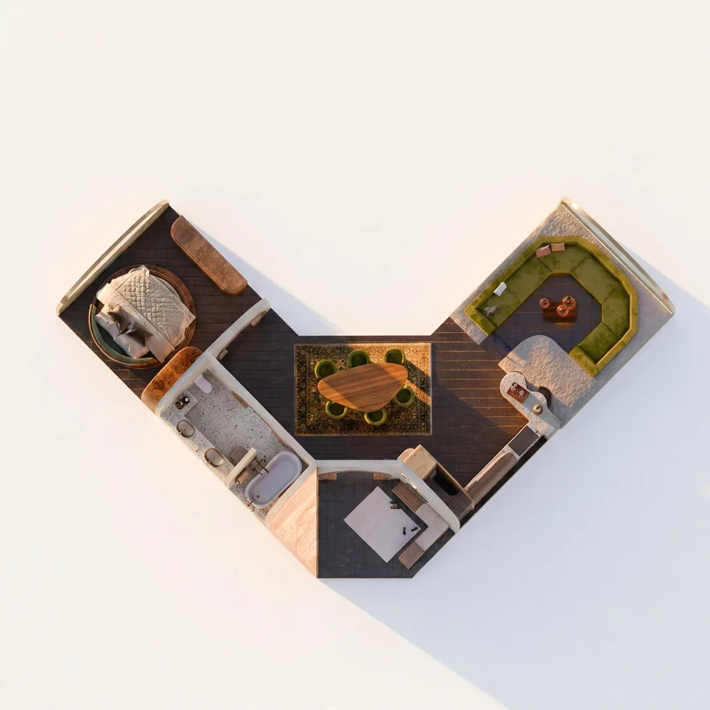
The layout runs about 95 m² total, split across rooms of 20, 17 and 34 m², arranged around the building’s bent, organic footprint. Getting real furniture and real circulation to work inside curved walls took a lot more back-and-forth than a straight one would have.

HOBBIT HOUSE 09
HOBBIT HOUSE 10

07

round openings

The round windows and doorways aren’t just a style choice carried over from the Hobbit reference. They’re structurally consistent with the whole earth-sheltered form, so the shape reads the same whether you’re looking at the building from outside or standing in a doorway looking through it.

HOBBIT HOUSE 11

08

closing

In the end, this house is less about copying a fantasy image and more about testing how far that kind of aesthetic can go before it stops being architecture. For me, that’s exactly where the project gets interesting.

03 / 05

01–06.2026

BESKID 2.0(03)

01

The Brief

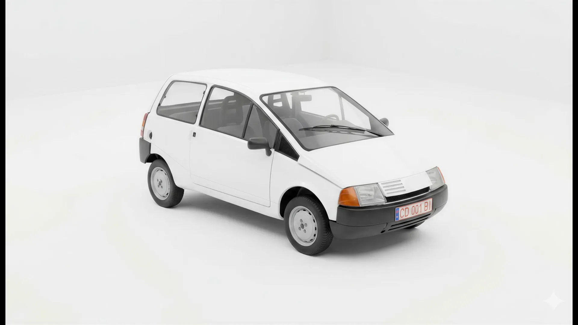
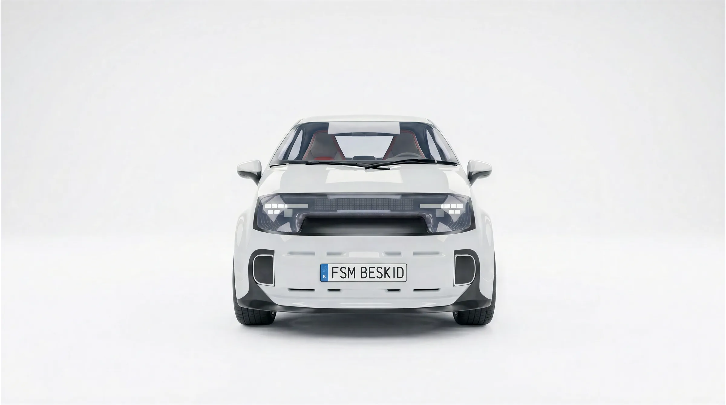
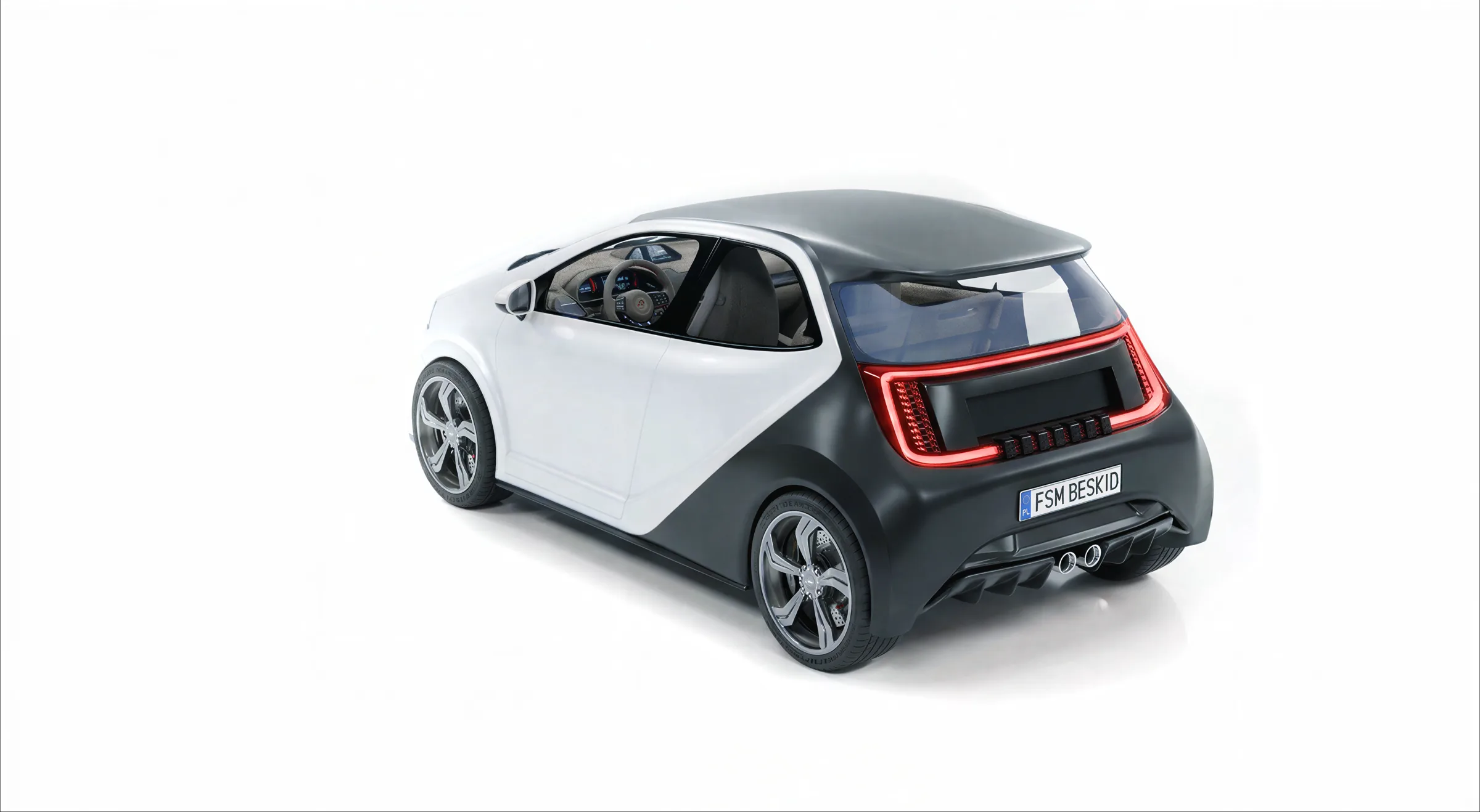
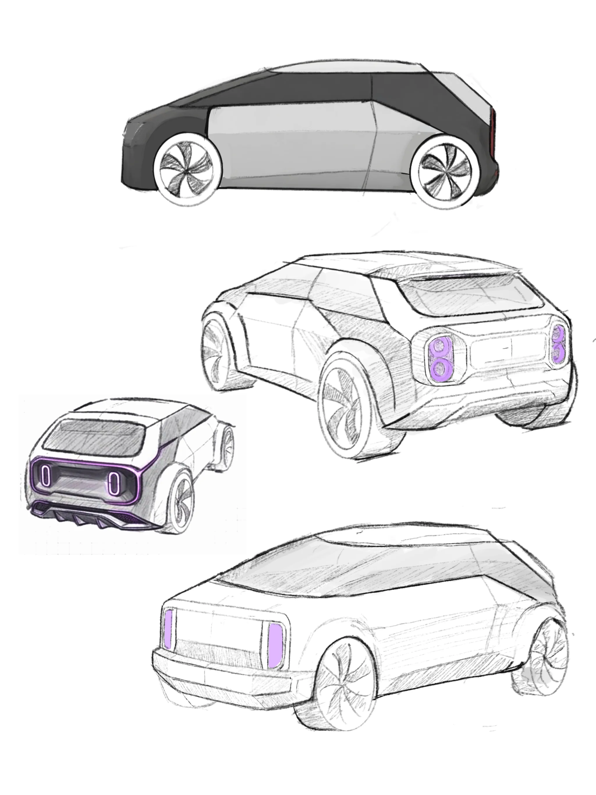
The FSM Beskid was Poland’s most advanced pre-1989 city car: a revolutionary, aerodynamic monobox design that was tragically shelved for political reasons. Beskid 2.0 answers a simple question: What if that project never stopped?

02

The Concept

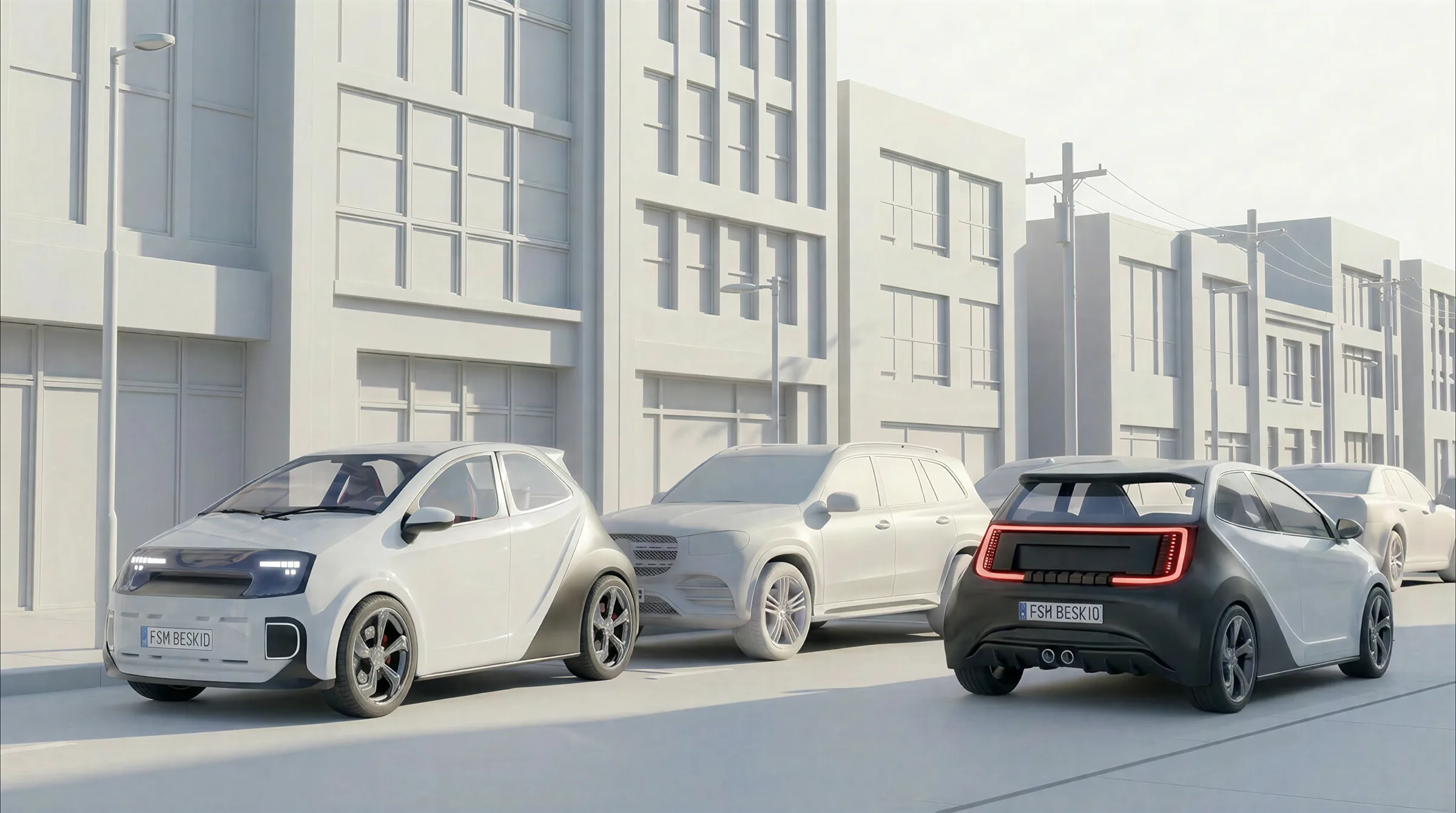
I didn’t want to create a nostalgic retro-tribute meant to be viewed from a polite distance. Instead, I approached this as if I were part of the original design team, finally allowed to finish what was started in the late ’80s. It’s the exact same DNA, just evolved for today.

BESKID 2.0 02

03

The Silhouette

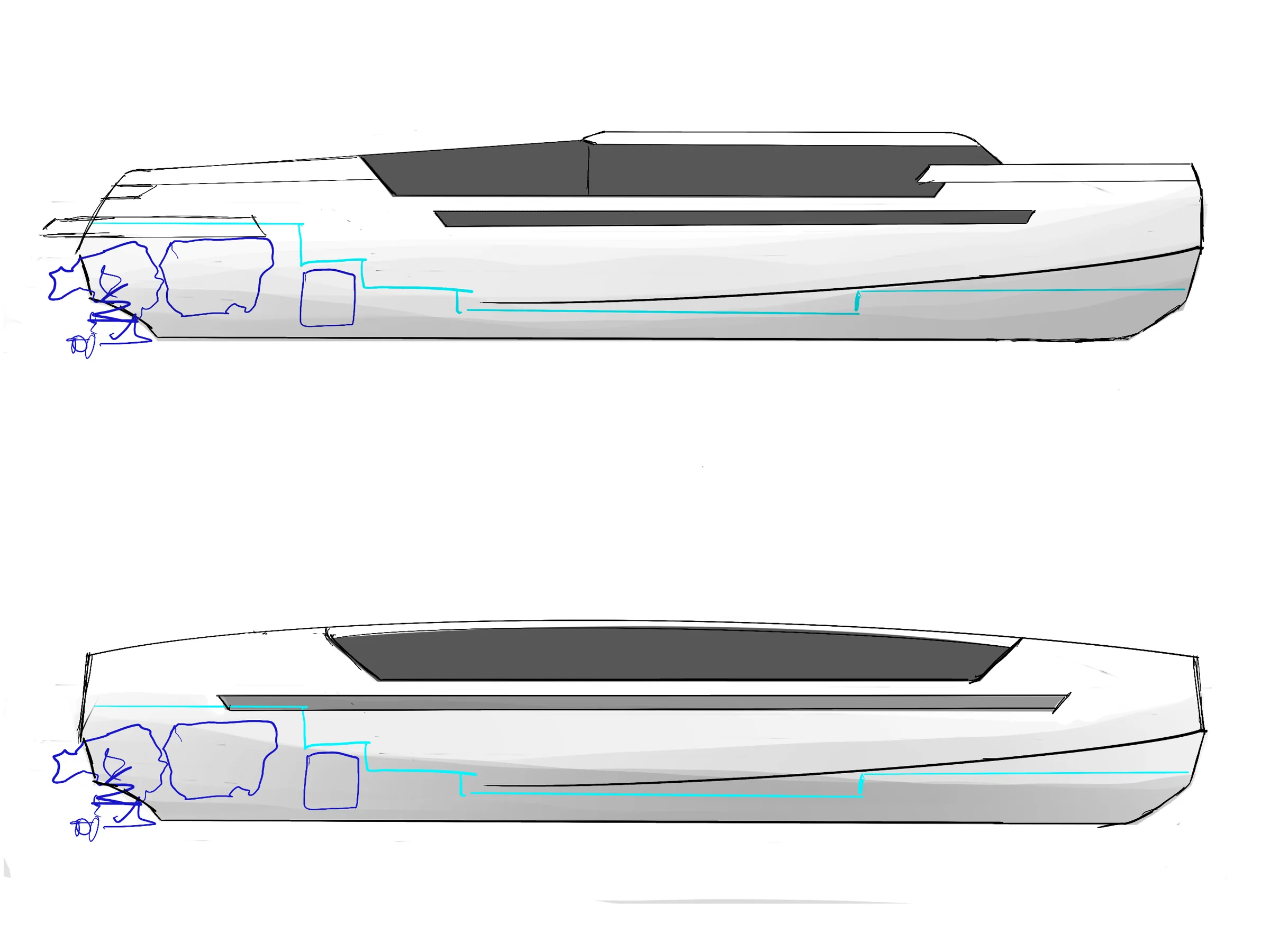
The monobox proportion was sacred. It’s what made the 1983 original so radical, predicting European small-car trends by years. While everything else was open for redesign, that distinct, single-volume shape had to remain instantly recognizable.
BESKID 2.0 03

04

Surfacing & Lighting

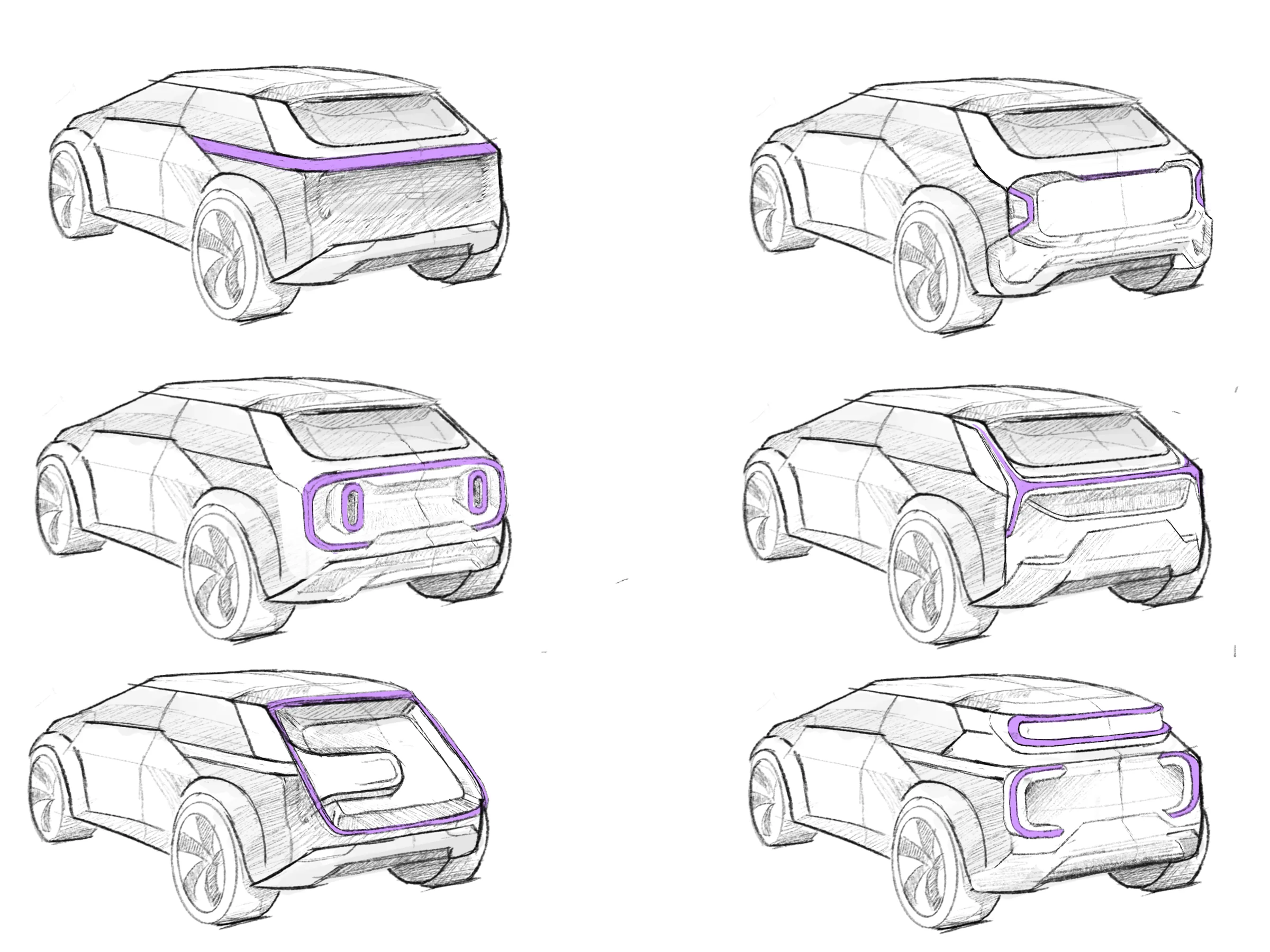
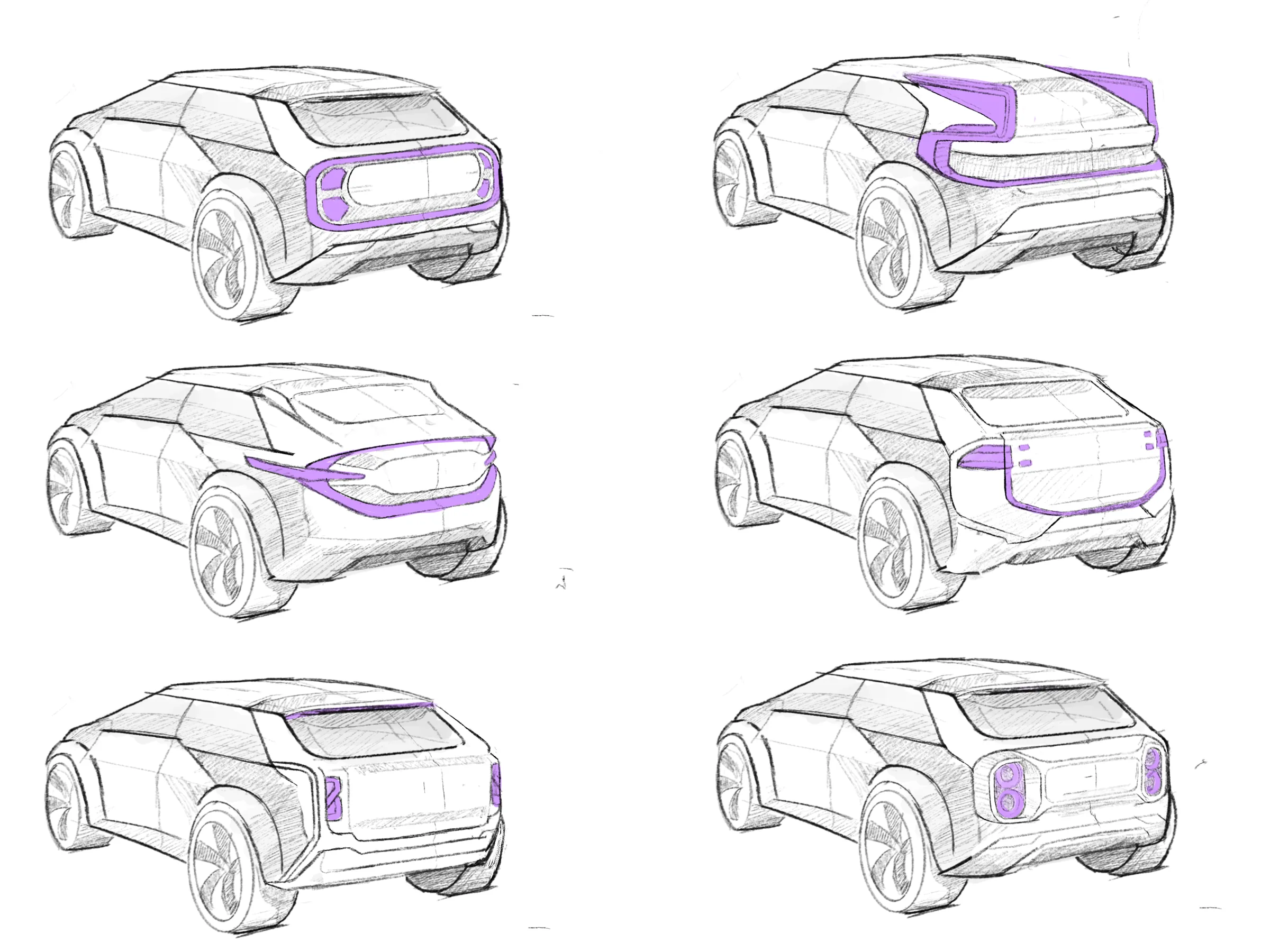
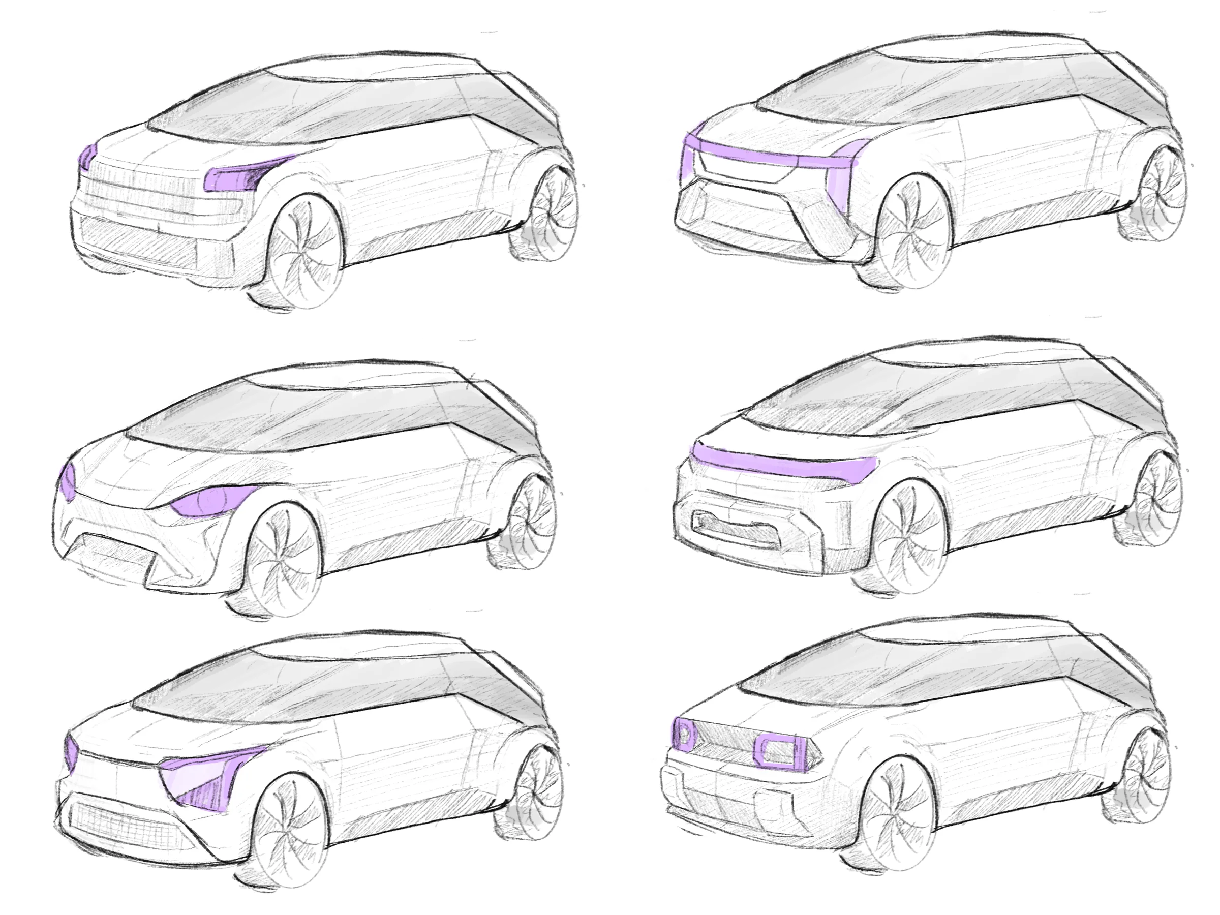
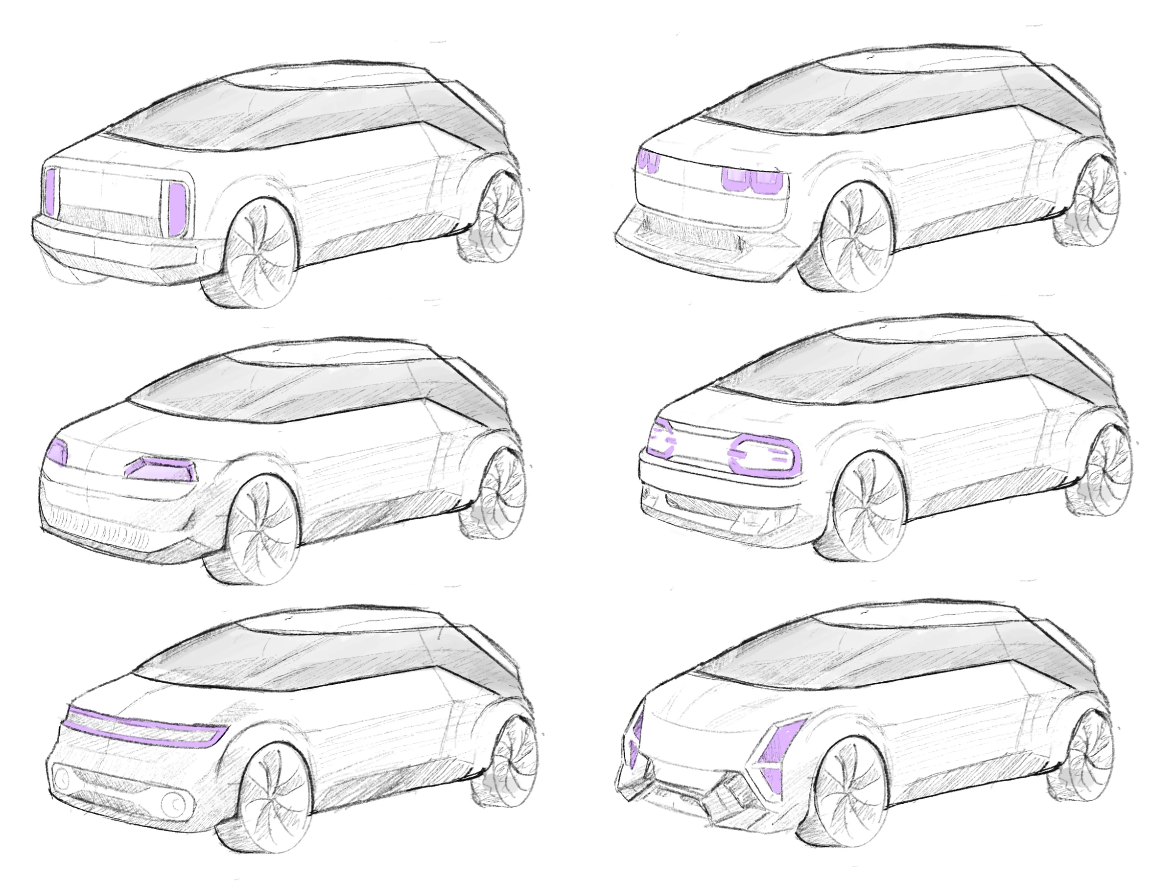
Where the original relied on smooth, simple panels dictated by ’80s budget constraints, I introduced sharper creases and split surfacing. Bulky chrome and separate lamp housings were replaced by seamless, integrated LED signatures. It’s the same soul, built on modern technology.

BESKID 2.0 04
BESKID 2.0 05
BESKID 2.0 06

05

Process: From Sketches to Blender

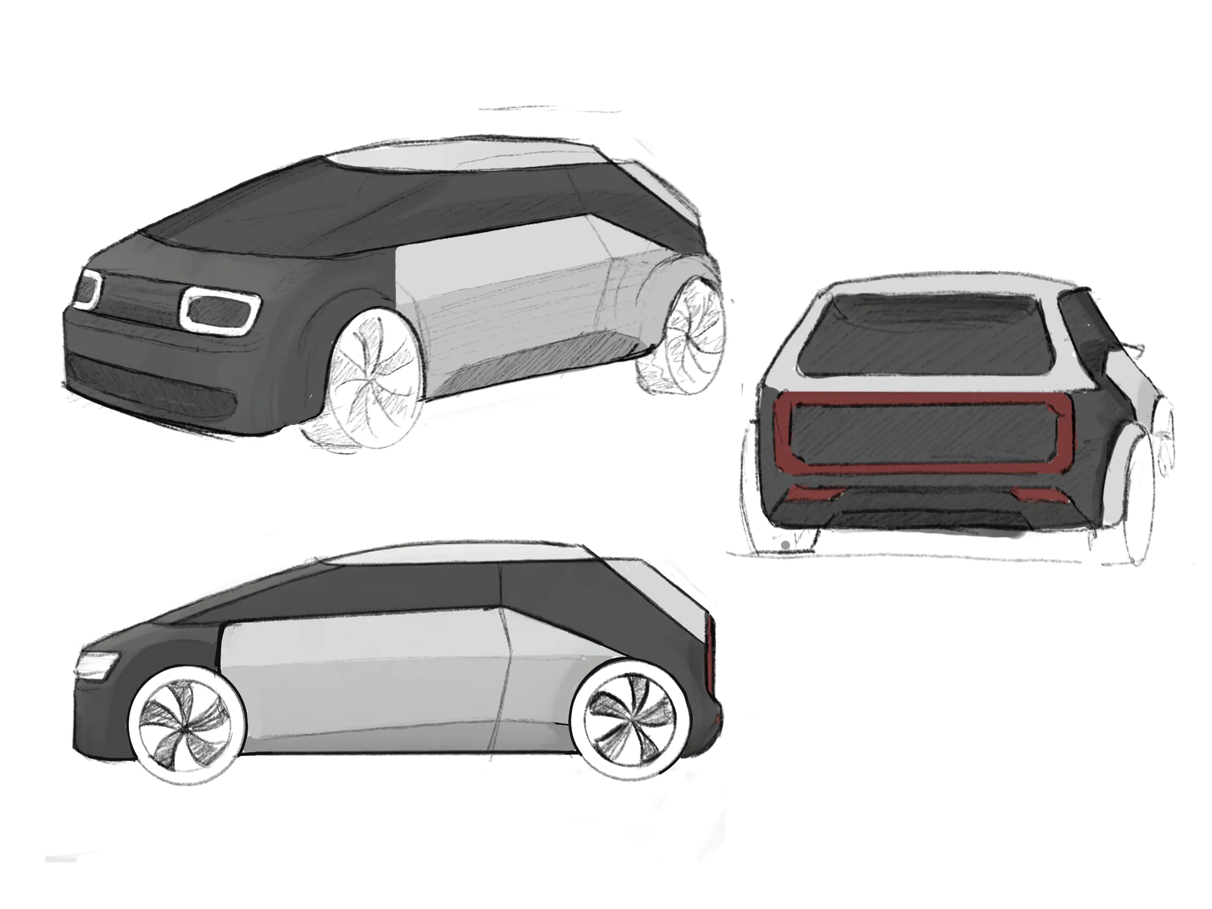
Before drawing a single new line, I dug deep into the original prototype’s hardpoints and proportions. I ran a set of quick sketch studies to see how far I could push the silhouette before it stopped reading as a Beskid. From there, the design transitioned directly into Blender. I developed the 3D model with the original’s iconic white-and-black two-tone color scheme as a foundational design requirement, a direct nod to how the surviving prototypes were photographed back then.

BESKID 2.0 07
BESKID 2.0 08
BESKID 2.0 09
BESKID 2.0 10

04 / 05

10.2024–01.2025

TENDER(04)

01

brief

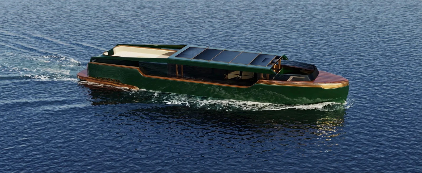
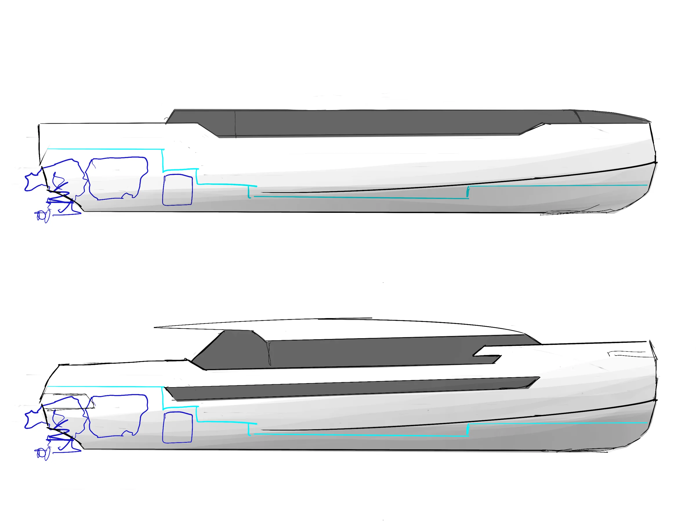
A tender is the small boat that ferries people between a megayacht and the shore, whenever the yacht itself is too big to dock. A group of Polish investors wanted to build a modern line of those, but the brief came with its hands tied in a few places: hull dimensions fixed in advance, floor levels dictated by where the engine had to sit, a strict technical envelope from a team that had already worked out the production side. My job was to design old-money luxury inside a shape I didn’t get to choose.

TENDER 01

02

concept

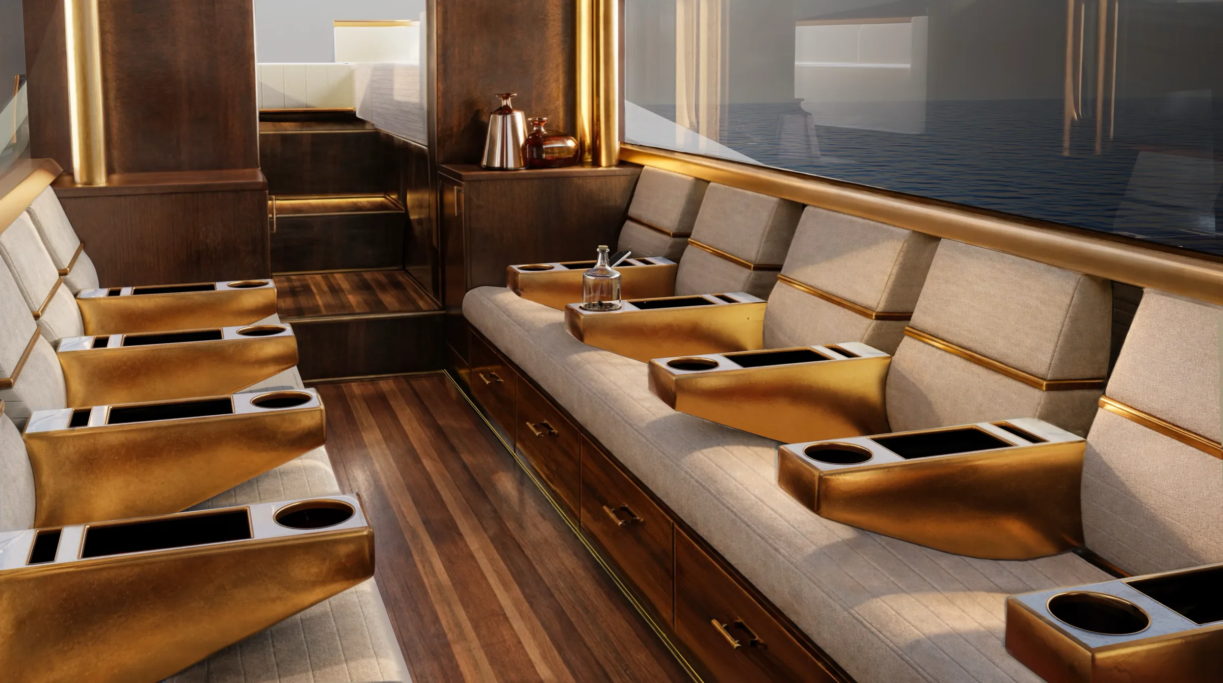
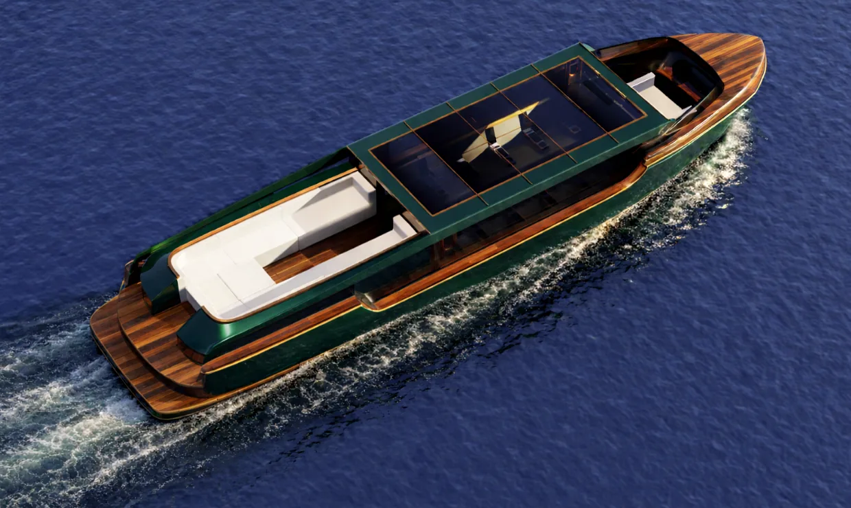
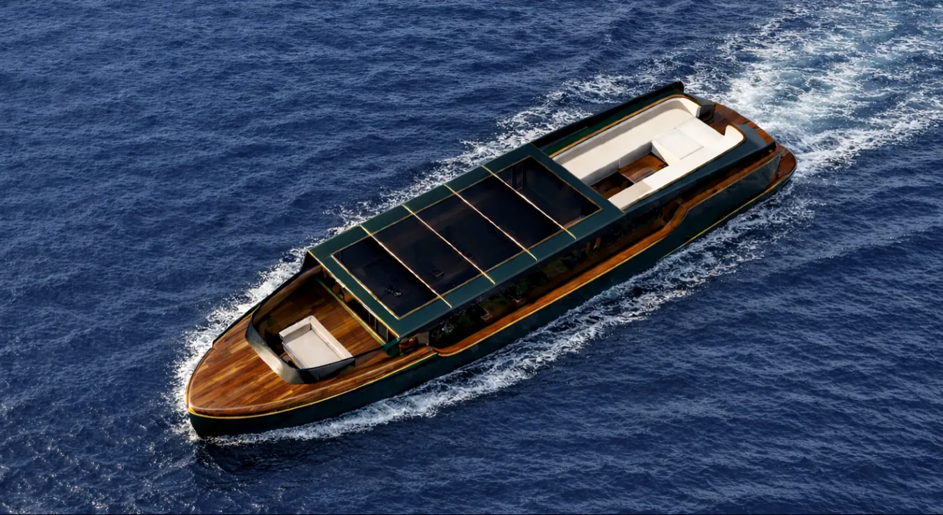
The goal was to keep that old-money feel. While using deep green hull, polished wood decking, and brass accents, I tried pushing the style somewhere more modern than tenders usually go. It didn’t need to look conservative to feel expensive.

03

interior

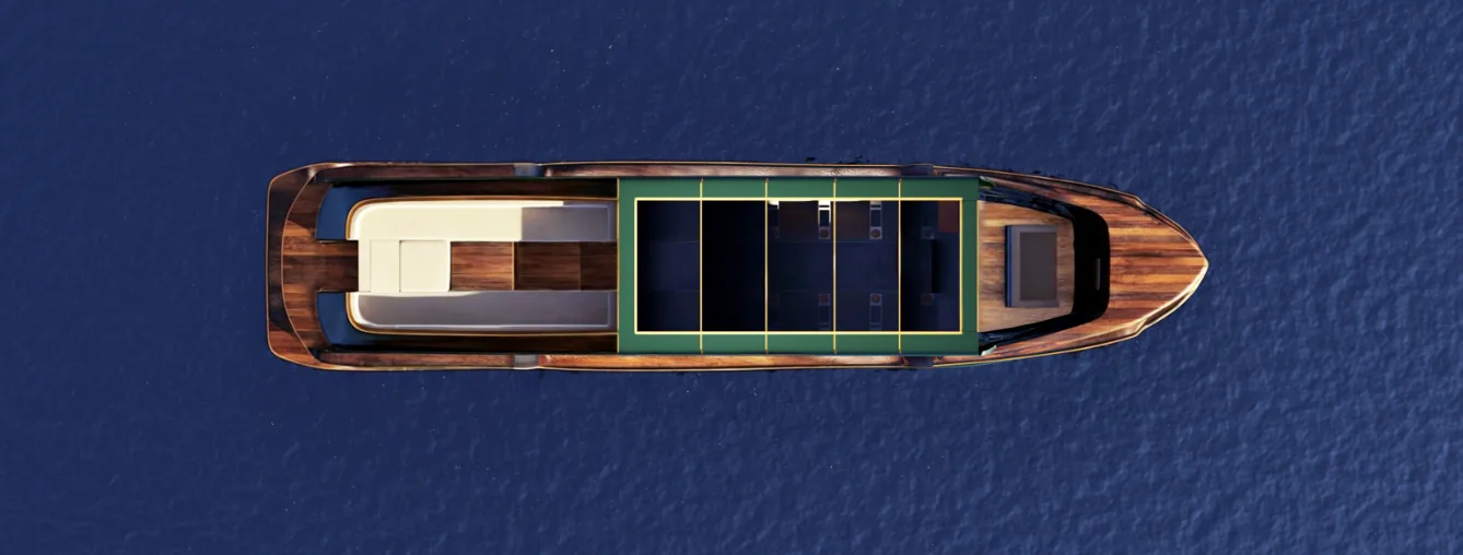
Inside, it’s deliberately restrained: a cabin with seating, small drawers for storage, and a fridge for cold drinks. It’s not trying to be more than what it is: a comfortable few minutes between the yacht and the shore.

TENDER 02
TENDER 03

04

the lifting roof

Megayacht deck height and onboard cranes cap how tall a tender can be, which makes moving around inside genuinely awkward. The lifting roof solves that: it opens up headroom while the tender’s docked or at rest, then folds back down for transit.

TENDER 04

05

helm position

The helm sits open at the bow, with no roof over it. That split was intentional: a sheltered social space at the back, and an exposed, functional driving position up front.

TENDER 05
TENDER 06
TENDER 07

06

process

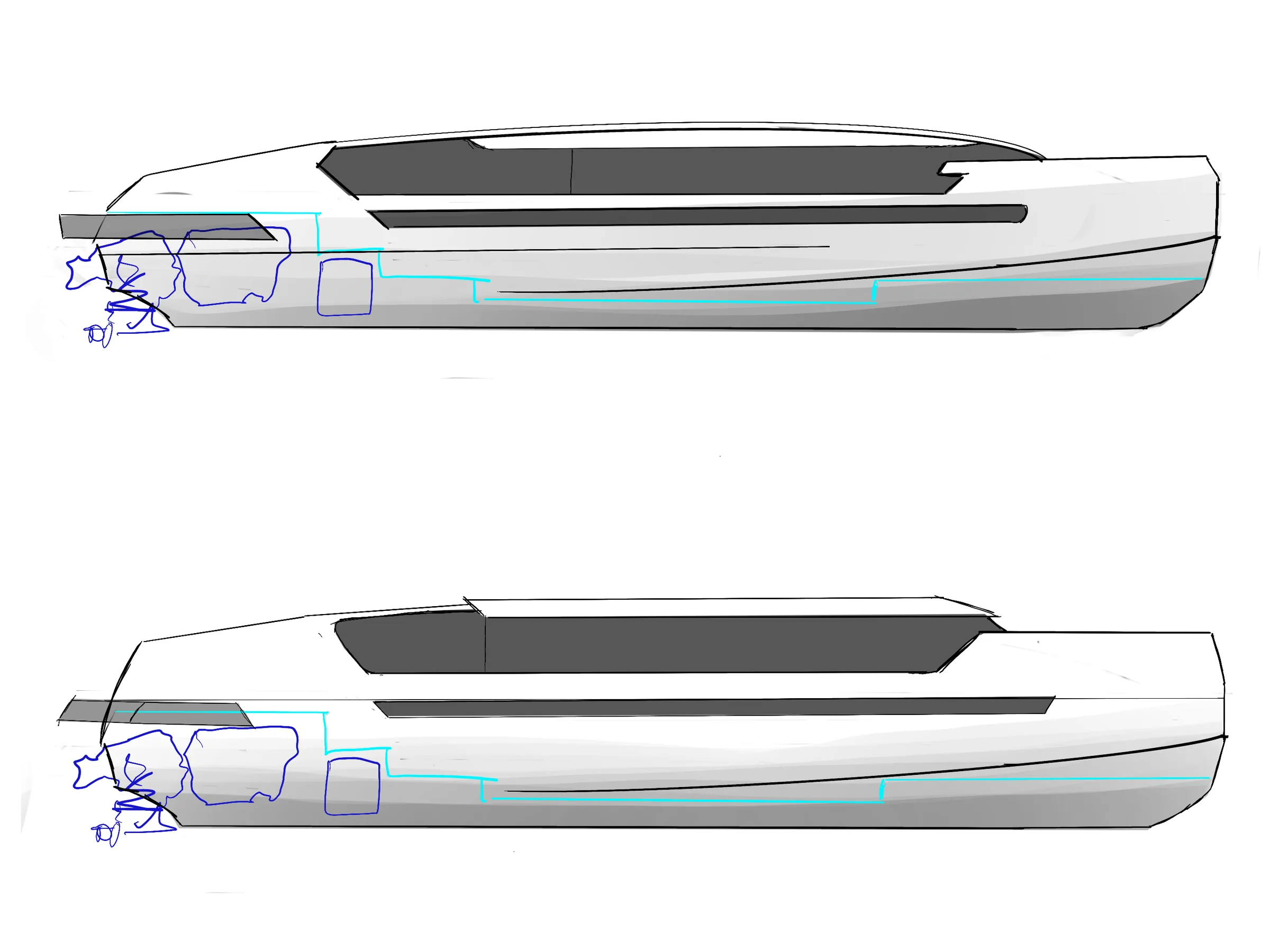
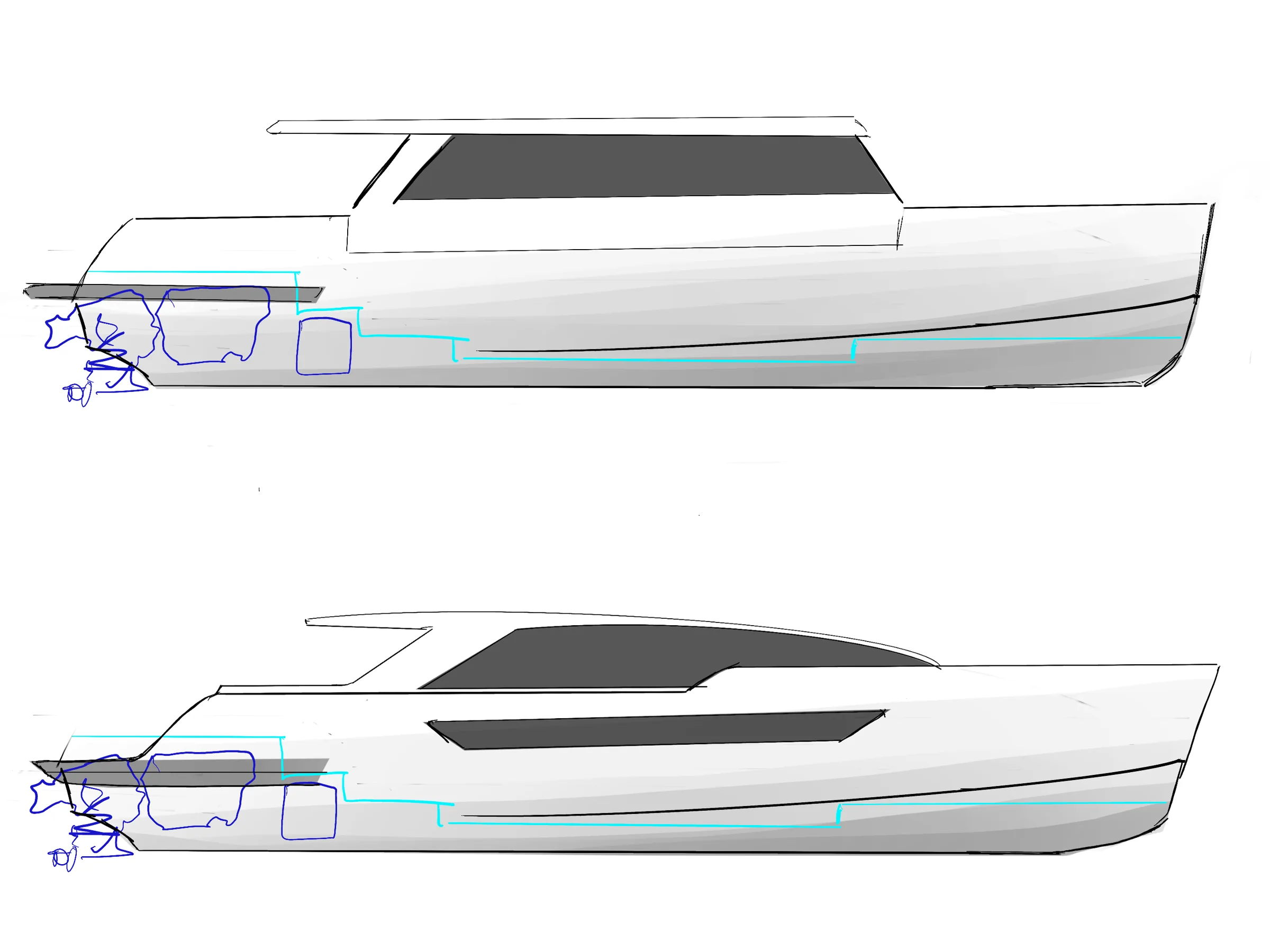
With the hull and floor structure locked in early, the job wasn’t inventing space so much as making a tight technical envelope feel calm and generous. Most of the actual design work happened in the details: proportions, trim lines, how the brass breaks up the dark hull.

TENDER 08
TENDER 09

07

closing

It’s the project that taught me the most about designing inside constraints instead of around them, and how much can still feel personal even when half the dimensions were decided before I got there.

05 / 05

01–06.2024

ŁAZIK(05)

01

brief

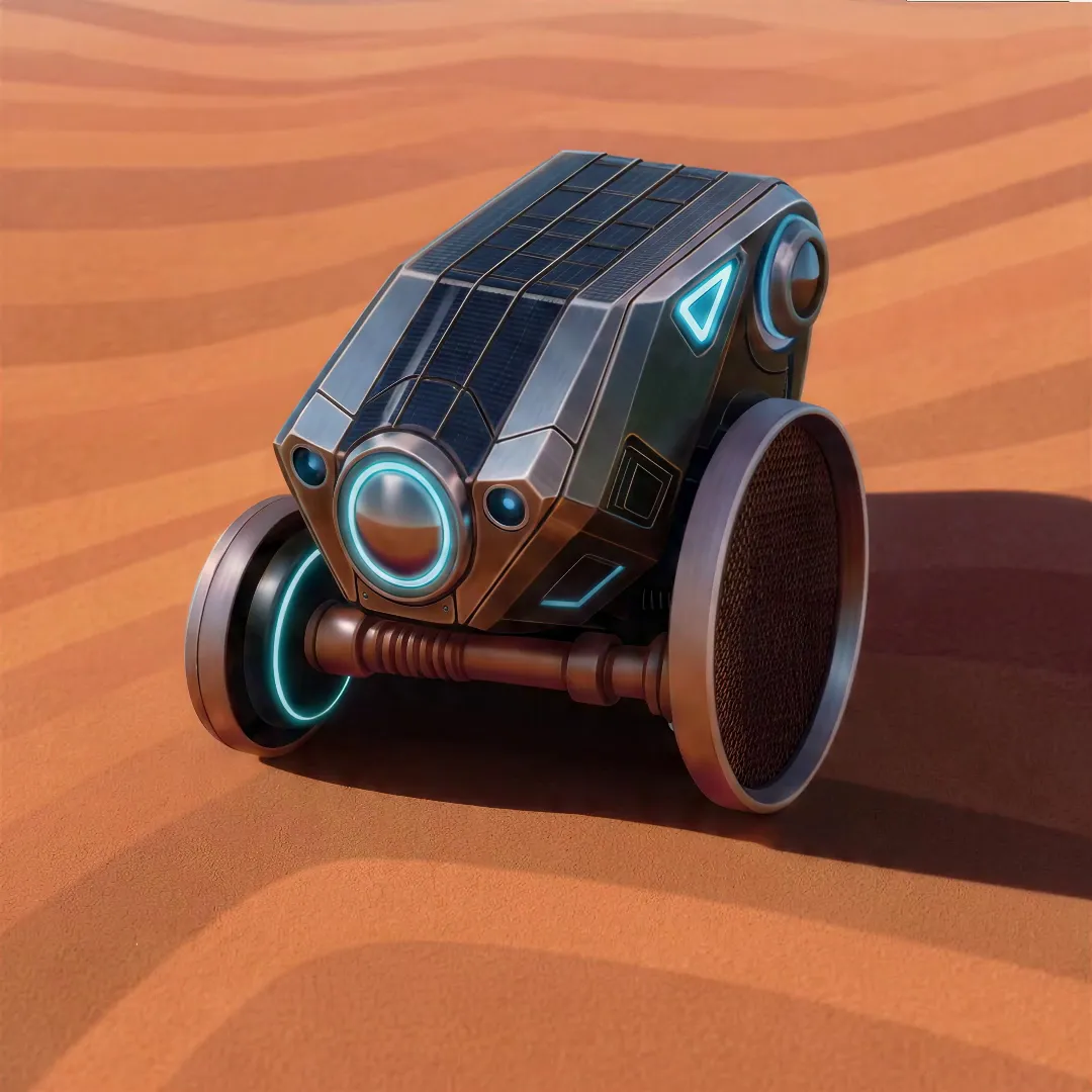
ŁAZIK is a concept for a small surface rover, a scout for ground nobody has mapped yet: sand, dust and loose rock. Rather than a laboratory on wheels, I wanted something light enough to go first and take a look before anything bigger follows.

02

concept

Two wheels, one axle and a body slung between them. Cutting the rover down to that took away most of the mechanics such vehicles usually carry, and let the wheels do the work of the structure. The body only has to hang between them and stay level.

03

the shell

The body is faceted rather than smooth: flat planes of brushed metal and dark glass, closer to a piece of equipment than to a character. The glazed roof is also where it collects light, so its shape is part of how it works, not just how it looks.

04

light and sensing

Its front is a single round lens ringed in light, and every other light on the body follows the same blue line. On a surface where nothing else moves, you should be able to read from a distance which way it is looking and what it is doing.

05

wheels

The wheels are open drums, wide and light, made to roll over loose sand instead of sinking into it. Their size is what lets such a small body clear rocks and ridges. Most of the rover’s height is wheel.

06

closing

ŁAZIK was modeled and rendered in Blender, from the first block-out to the dunes it is shown on. For me it was an exercise in reduction: how much of a vehicle you can take away before it stops being one.

LENA WOJEWÓDZKA

Wrocław, Poland

Back to top